Are Airbnb guests less energy efficient than their host?
Table of contents
TLDR
I compared the energy consumption of Airbnb guests versus their host, in the same appartment, during 2022. It appears that guests do in fact consume more energy than hosts. The data I used is available to any Airbnb host. I also open-sourced all the code I wrote for this analysis.
Introduction
European energy prices have soared in 2022. It’s gone to the point where some Airbnb hosts have become reluctant to rent, believing their guests are too wasteful and cost too much. You can see this by scrolling Airbnb groups on Facebook.

The question as to whether Airbnb guests are less energy efficient than their host is difficult to answer. First of all, I don’t work at Airbnb, so I don’t have access to a dataset of bookings. Even if I did work at Airbnb, I wouldn’t have access to the daily energy consumption of each flat. These are provided by the energy provider(s) the host has subscribed to, be it for gas or electricity.
Even if the data were available, the question would still be difficult to answer. Indeed, hosts don’t necessarily live in the flat they rent on Airbnb, so we can’t tell if they would have consumed less energy than their guests. Moreover, consider a host who stays at their flat in summer, and rents it out in winter. Naturally, guests will consume more energy than the host, but that’s just because more heat is needed in winter.
Ideally, we want to compare the guests to the host all other things being equal. In particular, we should discount the weather’s impact on energy consumption. We’ll attempt this in a visual manner, and then proceed with some regression analysis.
As it turns out, my SO bought a flat about a year ago. She’s been renting it out on Airbnb, as well as staying there from time to time. This is an interesting case, because we can compare her energy consumption with her guests. Naturally, we won’t be able to draw a general conclusion from analysing one listing over a year. But still, it’s an interesting learning exercise. Also, what I did should be straightforward to reproduce for other listings.
Building a dataset 🧑🏭
I thought I would write a brief section as to how I collected the data. Maybe this will encourage others to do the same. In fact, I’m quite sure it’s possible to create an app which allows any Airbnb host to do this without them having to write any code.
Airbnb bookings
Host stays
To do a fair comparison, I had to know the days when someone who didn’t book with Airbnb was in my SO’s appartment – basically friends and family. We did this by jogging our memory and backchecking our calendars. We manually inputted the dates into a table.
Weather
I didn’t have an easy time finding historical weather data. My SO’s flat is in Toulouse, France. I expected MeteoFrance to have a good open data offer. Alas, I didn’t manage to find hourly – or even daily – weather indicators that were freely available.
In the end, I found this SYNOP dataset on Opendatasoft. SYNOP corresponds to data coming from automated weather stations. The dataset I found provided values every 3 hours of the day, without too many gaps. Good enough.
Energy consumption
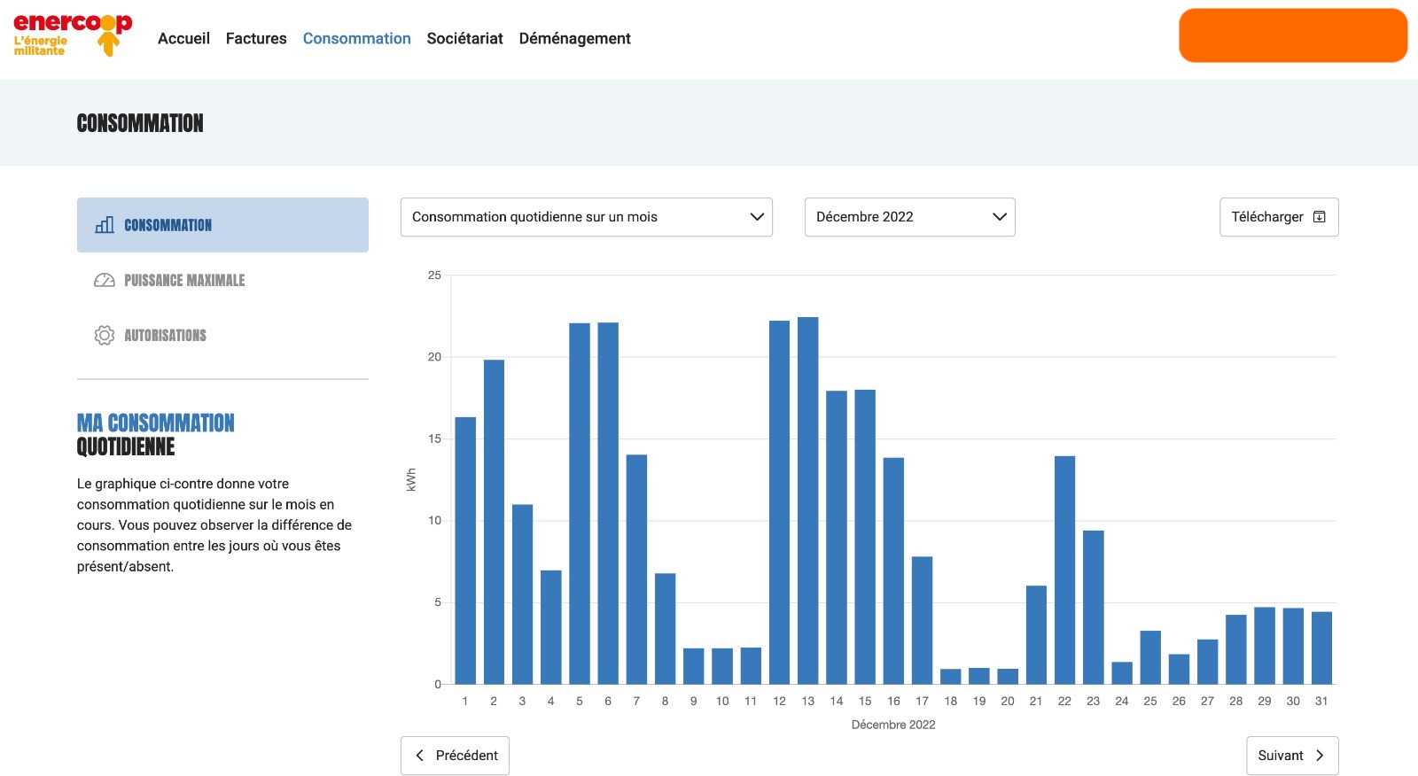
This is the trickiest part, as there are different possible energy setups. In my SO’s case, her flat is heated with electric radiators. Her flat is not linked up to a renewable energy source. Basically, all the flat’s energy is coming from her energy provider. In this case, she’s using Enercoop – whereas most people in France use EDF.
Enercoop is a French electric utility cooperative provider. All the electricity it provides comes from renewable energy. Even though it’s a cooperative without the size of EDF, I was delighted to find out they give access to historical consumption data. The data I used is daily, and is expressed in kilowatt-hour: the amount of kilowatts used in hour, summed over a day. It basically told me how much electricity was used per day.
Putting it together
At this point I had four separate files. I joined them via the date column they all shared, thus obtaining a table with 365 rows. This is what it looks like:
| date | kilowatt-hour | n_hosts | n_guests | temperature |
|---|---|---|---|---|
| 2022-01-01 | 2.171 | 0 | 0 | 7.87 |
| 2022-01-02 | 10.31 | 0 | 0 | 8.78 |
| 2022-01-03 | 16.107 | 0 | 1 | 8.35 |
| 2022-01-04 | 16.563 | 0 | 1 | 9.25 |
| 2022-01-05 | 17.098 | 0 | 1 | 5.7 |
The code I used to build this dataset is available here.
Visual inspection 🧑🎨
Energy usage over time
The first chart that naturally comes to mind is a side-by-side timeline of energy usage and outside temperature. Regarding temperature, I looked at the average temperature per day. I also thought it would be nice to shade the periods where the flat was booked through Airbnb, as well as when my SO was there. It was a bit of an uphill battle to get this done with Observable.
The first takeaway is that energy usage is (obviously) negatively correlated with the outside temperature. We can also see some different behaviors between hosts and guests. For instance, the temperature was relatively stable throughout March. Guests stayed in the first half of March, while hosts stayed during the second half. The guests consumed roughly three times more energy!
However, hosts don’t have a perfect behavior. They consumed a lot of electricity towards the end of the year, even though the temperatures were similar to those in March. It’s difficult to tell if there is a clear difference between hosts and guests with this chart.
Energy versus temperature
It’s nice to view the evolution of the data. However, a timeline obfuscates the difference between hosts and guests. I came up with a simpler chart once I realized this. I decided to simply do a scatter plot of temperature versus energy usage, and create one marker for each day in the year. I also colored each marker depending on whether the flat was occupied or not, and whom was occupying it.
I also drew a quadratic curve through each group of points. I preferred that to a straight line, because there is a non-linear relationship between temperature and electricity usage, which is somewhat apparent in the point cloud. This chart tells us that guests are more liberal as to electricity usage. They probably set the desired radiator temperature to a higher value than hosts. It’s cool to confirm that with data.
A second takeaway from this chart is that there are days where the energy consumption is quite high, but nobody is at home. Indeed, the orange curve should be a perfect straight line: it should be the energy consumption of the flat when nobody is there – this is called the talon de consommation in French. This is likely because the radiator is turned on, and someone forgot to turn if off before they left.
I checked. I looked at periods of time with nobody at home, as well as at least one day with a consumption over 5kWh. I found two occurrences: one in February and one in November. In both cases, it was guests who were at the flat right before. That’s not too bad considering there were 25 different guests over the year.
Regression analysis 🧑🔬
PS: I was very inspired by Martin Daniel’s article about the energy savings of his new roof. Also, the procedure I used is similar to what is done on degreedays.net, which I discovered after writing this post.
It’s quite clear that the outside temperature is the biggest cause of energy usage in the flat. It also seems that guests consume more energy than hosts. I decided to confirm this by running a regression analysis. The point being that you can’t consider the effect of all variables with a chart, and that a model is needed to go deeper.
I used the average daily temperature in the charts above. However, there’s something more appropriate called degree days – degré jour unifié in French. It basically sums up the hourly temperature differences with a reference temperature. I considered a reference temperature of 18°C. I also only counted heating degree days:
$$\sum_{h=1}^{24} max(0, 18 - t_h)$$
Heating degree days provide a better summary of the temperature profile throughout a day. They give a more faithful idea of the effort the radiator has to make to keep the temperature level.
In order to make the model interpretable, I transformed the n_guests and n_hosts variables into n_people and is_guest variables. This way, the regression model should determine the impact of the number of people in the flat, as well as the effect of those people being guests and not hosts.
I also thought it would be interesting to add an is_weekend variable in the mix. Indeed, when my SO and I are in the flat, one of us usually works from the flat during the week, while we don’t spend much time there on weekends.
                    OLS Regression Results
=============================================================
Target variable: kilowatt-hour    Adjusted R-squared: 0.844

=============================================================
                         coef   std err         t     P>|t|
-------------------------------------------------------------
is_weekend            -1.5339     0.435    -3.527     0.000
n_people               2.4652     0.331     7.455     0.000
is_guest               1.7145     0.451     3.798     0.000
heating_degree_days    0.0405     0.001    27.288     0.000
I ran a vanilla linear regression with statsmodel. The adjusted $R^2$ is 0.843, which is good enough to interpret the model. Moreover, all the regression coefficients appear to be significant. An interesting observation is that using the temperature variable instead of heating_degree_days leads to an ajusted $R^2$ of 0.578, which is significantly worse.
Positive coefficients linear regression are indicative of a variable being positively correlated with the target. In this case, the number of people, the fact that those people are guests, and the number of heating degree days are all positively correlated with the amount of kWh. Meanwhile, the weekend indicator is negatively correlated with the latter.
As a reminder, the interpretation of these coefficients is that if you hold everything else in the model constant, and add 1 to n_people, then the estimated kilowatt-hour will decrease by 2.46. Note that the coefficient depends on the units in which altitude is measured. Indeed, the heating_degree_days variable oscillates around 250 in Winter, which is why the heating_degree_days coefficient feels low. One way to interpret the heating_degree_days coefficient is that the temperature drops by 1°C, the necessary energy goes up by 24 * 0.0405 = 0.972 kWh.
We can see that each additional person in the flat roughly adds 2.5kWh. Moreover, it’s quite clear that there is a “guest effect”. I wouldn’t say the effect is huge, but it exists. This confirms what we noticed on the charts above.
Possible next steps
I’ve dumped the code I used to build the dataset and model it here. I’ve also placed the code for making the charts with Observable here. There’s no reason why this work couldn’t be reproduced for other Airbnb hosts. In fact, the ideal thing to do would be to build a no-code app where Airbnb hosts upload the necessary files. The charts and analysis could all be automated.
The results of this blog post definitely can’t be extrapolated just yet. But if it were possible to collect this data for several hosts, it might be possible to confirm this pattern of guests being more energy wasteful than their hosts.
If there really were a proven effect, it would be interesting to list possible remedies. It might be possible to educate guests in order to remind them to be mindful. There are also several ways to limit the maximum usage of radiators and other appliances. I’m sure Airbnb could have a lot of impact here.