Organising a Kaggle InClass competition with a fairness metric
Table of contents
Some context
I co-organised a data science competition during the second half of 2020. This was in fact the 5th edition of the “Défi IA”, which is a recurring event that happens on a yearly basis. It is essentially a supervised machine learning competition for students from French speaking universities and engineering schools. This year was the first time that Kaggle was used to host the competition. Before that we used a custom platform that I wrote during my student years. You can read more about this here.
I’m not going to go into a lot of depth with regards to the competition details, simply because everything is already explained on Kaggle. In a nutshell, the goal of the competition is to predict a person’s job from their bio. A bio is a short description of said person. For instance, the following job description corresponds to a professor:
She is also a Ronald D. Asmus Policy Entrepreneur Fellow with the German Marshall Fund and is a Visiting Fellow at the Centre for International Studies (CIS) at the University of Oxford. This commentary first appeared at Sada, an online journal published by the Carnegie Endowment for International Peace.
Along with the bio and the job title, we also know each person’s gender. For the sake of simplicity we only considered cisgender people, and not LGBTQIA+ people. We also only included 20 different jobs. Note that we obtained our data following the opensource code provided with the 2019 Microsoft paper entitled Bias in Bios: A Case Study of Semantic Representation Bias in a High-Stakes Setting.
In the above example, it’s quite easy to guess that the bio corresponds to a professor. Words such as “university” and “published” are highly indicative of a professor. In my perception of reality, a university professor isn’t necessarily associated with any gender in particular. This gut feeling is verified if we look at the competition data:
| category | part | female | male |
|---|---|---|---|
| accountant | test | 40.69% | 59.31% |
| accountant | train | 36.17% | 63.83% |
| architect | test | 24.21% | 75.79% |
| architect | train | 22.50% | 77.50% |
| attorney | test | 37.77% | 62.23% |
| attorney | train | 37.76% | 62.24% |
| chiropractor | test | 28.92% | 71.08% |
| chiropractor | train | 27.81% | 72.19% |
| comedian | test | 21.91% | 78.09% |
| comedian | train | 21.05% | 78.95% |
| composer | test | 16.57% | 83.43% |
| composer | train | 16.29% | 83.71% |
| dentist | test | 34.85% | 65.15% |
| dentist | train | 34.77% | 65.23% |
| dietitian | test | 92.74% | 7.26% |
| dietitian | train | 92.66% | 7.34% |
| dj | test | 14.80% | 85.20% |
| dj | train | 15.04% | 84.96% |
| filmmaker | test | 30.63% | 69.37% |
| filmmaker | train | 33.80% | 66.20% |
| interior_designer | test | 78.04% | 21.96% |
| interior_designer | train | 80.89% | 19.11% |
| journalist | test | 48.60% | 51.40% |
| journalist | train | 49.80% | 50.20% |
| model | test | 77.81% | 22.19% |
| model | train | 82.58% | 17.42% |
| nurse | test | 91.03% | 8.97% |
| nurse | train | 91.06% | 8.94% |
| painter | test | 45.45% | 54.55% |
| painter | train | 46.12% | 53.88% |
| paralegal | test | 86.46% | 13.54% |
| paralegal | train | 84.18% | 15.82% |
| pastor | test | 24.10% | 75.90% |
| pastor | train | 24.05% | 75.95% |
| personal_trainer | test | 42.72% | 57.28% |
| personal_trainer | train | 45.11% | 54.89% |
| photographer | test | 35.18% | 64.82% |
| photographer | train | 35.02% | 64.98% |
| physician | test | 40.45% | 59.55% |
| physician | train | 39.47% | 60.53% |
| poet | test | 47.77% | 52.23% |
| poet | train | 50.16% | 49.84% |
| professor | test | 45.50% | 54.50% |
| professor | train | 44.88% | 55.12% |
| psychologist | test | 61.96% | 38.04% |
| psychologist | train | 61.76% | 38.24% |
| rapper | test | 12.25% | 87.75% |
| rapper | train | 8.17% | 91.83% |
| software_engineer | test | 16.06% | 83.94% |
| software_engineer | train | 15.10% | 84.90% |
| surgeon | test | 14.16% | 85.84% |
| surgeon | train | 13.45% | 86.55% |
| teacher | test | 58.43% | 41.57% |
| teacher | train | 59.27% | 40.73% |
| yoga_teacher | test | 80.57% | 19.43% |
| yoga_teacher | train | 85.06% | 14.94% |
Other jobs are more polarised. For instance, rappers are mostly men and yoga teachers are typically women. This is just the way things are in modern western societies. I am in no position to say if this state of things is good or bad. What I do know is that machine learning models replicate the bias that can be found in data in their predictions. Machine learning models are meant to be accurate, and therefore would rely on gendered words such as “she” and “his” to make their predictions. Machine learning is very pragmatic that way.
For whatever reason, we might want to build models that don’t exploit gender to make a prediction. We might want to do this because as a society we believe that each gender should be equally represented in each job – note that I’m not expressing an opinion. To do so we may want to break the negative reinforcement loop that automated decisions would entail. Concretely, we could prefer to have a decision process that is less accurate while being fairer. There is a whole area of research called fair learning that tackles these questions.
Fair learning is very exciting, and we thought it would be worthwhile to include fairness as a competition metric. The main goal being to encourage students to discover fair learning by themselves, as it not necessarily a topic that is being taught in their curriculums.
The fairness metric
What is fair? It’s a very vague concept when you think about it for a bit. I’m not going to into a lot of detail as many things have already been written on the topic. For instance, see this light article by Adrian Colyer (aka the morning paper).
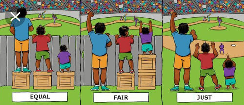
We went with the notion of disparate impact. Essentially, our motivation was for the students to make predictions that are not biased towards one gender in particular. For instance, if we tallied up all the “rapper” predictions, well we would consider a model to be fair if 50% of those predictions are for women and 50% are for men. We compute the disparate impact for each job and average them in order to obtain a so-called “macro disparate impact”:
$$ \frac{1}{jobs} \sum_{job \in jobs} \frac{max(P(male \mid job), P(female \mid job))}{min(P(male \mid job), P(female \mid job))} $$
This metric is very straightforward to compute. Say you have a people dataframe that associates job predictions with genders:
>>> people.head()
           job gender
0    professor      F
1   accountant      M
2    professor      M
3    architect      M
4    architect      M
The job column corresponds to the predictions made by a model. The gender column is a ground-truth. We simply have to build the pivot table I showed above and count the number of times each gender appears for each job.
def macro_disparate_impact(people):
    counts = (
        people
        .groupby(['job', 'gender'])
        .size()
        .unstack('gender')
    )
    disparate_impacts = (
        counts[['M', 'F']].max(axis='columns') /
        counts[['M', 'F']].min(axis='columns')
    )
    return disparate_impacts.mean()
Note that the Kaggle leaderboard ranking used the macro F1 score proposed on the platform. Kaggle effectively locks you in and doesn’t allow you to provide a custom metric. Therefore, once the competition was over, I downloaded the best private submission from each team and ran this metric myself on each submission. Thankfully, Kaggle’s admin interface for managing submissions is quite good.
I picked this metric because it makes sense to me. It encourages a model to be discriminative in a good way. To minimise the metric, a model has to restrain itself from assigning the most likely job to a person. In other words, the model necessarily has to be less accurate. But it’s a tradeoff! I think this pretty cool, and as far as I know this hasn’t been done on Kaggle before.
In the case of this competition, we assume that the goal is to reach a perfect balance of men and women for each job. However, we could perfectly well imagine a more nuanced goal. For instance, we could say that we would like 30% of rappers to be women and 70% to be men. This would still be “better” than a 10%/90% split – which is the reality – but might also be more realistic.
One thing to notice is that a perfect macro disparate impact of 1 is only achievable if the genders are balanced. I only realised this after starting the competition thanks a remark from Philippe Besse. It was kindly suggested to me to normalise by the size of each gender pool in order to account for gender imbalance. In the end it didn’t matter that much because there are only slightly more men than women in the dataset. Moreover, the point of this metric is simply to rank the competitors, and this imbalance equally affects each competitor.
What people did
Once the competition was over, the students were instructed to send me their code. This was mostly to verify they hadn’t cheated in any way. It also allowed me to inspect what they had done. Moreover, teams that didn’t send their code were not eligible to the final ranking. Out of the 78 teams, only 30 sent me their code. Here are some statistics:
- Everyone used Python. That’s somewhat interesting because during the past years there were still some teams that used R.
- Apart from one team, everyone sent me one or more Jupyter Notebooks. I wonder if they know about Jupyter Lab 😉
- 14 used some flavor of BERT.
- 14 preprocessed the text in some way (lowercasing, stemming, stop words, etc.)
- Absolutely no team did any effort to make their model fairer with respect to both genders 😩
- 2 did cross-validation. The rest did a simple train/test split, if that.
- 8 used a TF-IDF approach.
- 16 really used scikit-learn. Other teams used scikit-learn only for metrics and train/test splitting.
- My estimate is that 17 teams made a real effort. From what I can tell, the 12 others just mindlessly imported libraries, figured out the API, and called it a day.
- 10 used Hugging Face’s transformers library.
- 4 did data augmentation.
- 8 did exploratory data analysis (EDA), although others might have done but didn’t include it in what they showed me.
- 12 used NLTK, which I find pretty cool considering how old it is.
- 2 attempted to rebalance the dataset.
- 2 built their own model in PyTorch.
- 8 built their own model with Keras.
- 3 built an RNN.
- 2 did model ensembling.
- 7 used the simpletransformers library, which I find to be frightfully high level.
- 2 used spaCy
- 2 used Gensim
Overall, I found the code quality to be quite poor. Most notebooks were very bloated with dozens of imports, many commented lines, long uncommented blocks of obscure logic. Another striking observation is that there were few similarities between different notebooks in terms of code structure. The fit/predict paradigm remains, but there seems to be little convention as to the rest of the machine learning lifecycle. Each team invented its own little paradigms and didn’t necessarily take the time to organise and rethink its approach. A positive note is that I can see that most teams made a good effort and spent time exploring the library ecosystem.
Rankings
The Kaggle leaderboard measured the macro F1 score of the job predictions. In other words, the goal was simply to be as accurate as possible. I then took the 10 highest performers on the private leaderboard and measured their macro disparate impact to establish the fairness rankings. I did this to highlight the tradeoff that had to be made between accuracy and fairness. For instance, a very accurate solution is cool but it won’t get to be used in a real-world application if we know it’s not fair. Likewise, it’s very easy to provide a perfectly solution by simply flipping a coin, but there’s no point in doing so if the predictions are not accurate as well.

I mentioned above that a perfect macro disparate impact is equal to 1. The macro disparate impact in the data is 3.62. That is, if we use the ground truth labels as predictions and compute the macro disparate impact, then we obtain 3.62. The point of this competition is to do better than this, and not just focus on the predictive performance of the model.
Sadly, it seems that no teams managed to really remove any bias whatsoever from their model. I’ll be honest: I’m very disappointed with the way this turned out. The best performing teams seem to have made no effort whatsoever. Fair learning is a relatively sophisticated topic, so I wouldn’t be surprised that students had some difficulties. With the whole COVID 19 situation, the relationship between teachers and students might have been affected, and teachers might not have had the opportunity to discuss a topic that is not part of the official curriculum with their students.
And yet, my gut feeling is that many teams have had the wrong focus. Having looked at each team’s code, most people used very sophisticated neural networks based on transformer architectures. That’s great, because I know for a fact that the latter are not part of the official curriculum in French schools as well, so it shows some form of motivation. However, I’m worried that students used a “toolbox” approach whereby they imported and trained a fancy model because it’s the goût du jour.
In my opinion, if a student is able to understand BERT and transformers, then surely she is capable of understanding fair learning. The problem is that I believe that they don’t understand these notions very well. Instead, they only manage to figure out the API provided by a library they found on GitHub and imported in their notebook. I fear that they simply didn’t do any fair learning because the toolboxes they used didn’t provide any fair learning capability. That’s very worrying. It might also hint at a blindspot in the library ecosystem. I would love to be wrong about all this.
Here is the ranking with respect to fairness for the top 10 competitors on the Kaggle private leaderboard:
| Country | School | Team name | Macro F1 | Disparate impact | Sent code |
|---|---|---|---|---|---|
| France | UPS | Test | 0.81971 | 3.49578 | ✅ |
| France | ENSEEIHT | Pyramids | 0.82685 | 3.74924 | ✅ |
| France | UPS | FairleNessSROnly | 0.81443 | 3.94925 | ❌ |
| France | INSA | Salle104 | 0.82598 | 3.95849 | ✅ |
| France | UR2 | WeTried | 0.84247 | 4.00975 | ✅ |
| Cameroun | ENSPY | Fred | 0.82733 | 4.03571 | ✅ |
| France | Université de Bordeaux | CMI ISI datadax | 0.81639 | 4.10829 | ✅ |
| Cameroun | ENSPY | GI | 0.82446 | 4.13195 | ✅ |
| France | Université Jean Monnet | Minions | 0.82354 | 4.23495 | ✅ |
| France | UJM | BravoNils | 0.82932 | 4.26414 | ✅ |
Note: I removed Olivier Chotin from the ranking because he’s not a student.
Again, I’m quite disappointed with these standings from an effort point of view. While writing this blog post, I took 10 minutes to see the effect of replacing “he” by “she” and “his” by “her” on a plain and simple logistic regression. In my cross-validation, the macro disparate impact went from 5.11 and 3.85 and the macro F1 score remained simple. It would have been nice to see at least a couple of teams that produced some decent fairness results. Alas, I’m sorry to say, these models wouldn’t be used. Regardless of their accuracy, the main objective of this competition was to reduce the disparate impact.
With regards to the macro F1 score that was used to establish the Kaggle leaderboard, here is a summary of the best solution with a breakdown by job:
                   precision    recall  f1-score   support

       accountant       0.78      0.88      0.83       694
        architect       0.75      0.84      0.79      1371
         attorney       0.94      0.91      0.92      4832
     chiropractor       0.69      0.81      0.75       284
         comedian       0.86      0.88      0.87       386
         composer       0.94      0.89      0.91       897
          dentist       0.96      0.95      0.96      1463
        dietitian       0.87      0.88      0.87       545
               dj       0.83      0.88      0.86       211
        filmmaker       0.88      0.88      0.88      1012
interior_designer       0.78      0.83      0.80       201
       journalist       0.85      0.82      0.83      3068
            model       0.85      0.89      0.87       978
            nurse       0.87      0.91      0.89      2977
          painter       0.87      0.85      0.86      1128
        paralegal       0.69      0.91      0.78       174
           pastor       0.78      0.72      0.75       393
 personal_trainer       0.79      0.84      0.81       194
     photographer       0.92      0.90      0.91      3731
        physician       0.77      0.81      0.79      2715
             poet       0.84      0.84      0.84      1107
        professor       0.95      0.92      0.93     18266
     psychologist       0.81      0.85      0.83      2514
           rapper       0.90      0.86      0.88       212
software_engineer       0.83      0.79      0.81      1013
          surgeon       0.80      0.86      0.83      1516
          teacher       0.69      0.72      0.71      2147
     yoga_teacher       0.81      0.74      0.78       271

         accuracy                           0.88     54300
        macro avg       0.83      0.85      0.84     54300
     weighted avg       0.88      0.88      0.88     54300
It seems that the F1 scores are lower for jobs that are less biased towards either gender. For instance, the model performs worse for physicians and teachers than for rappers and nurses. This could be indicative that the model uses gendered words to help it make its predictions, which is worrying. Then again, the model performs very well for teachers, but that could also be because teachers are easy to identify. I didn’t go very deep into any kind of analysis, but I’m confident it would yield interesting results.
It turns out that 1,927 out of the 54,300 test documents were incorrectly classified by each of the 78 teams. Here are some of these documents:
14023 - everyone said yoga teacher
She offers a free and creative approach to Yoga. Reni's classes are designed intelligently to achieve specific goals and energetic effects. Her teaching is based on the method of Therapeutic Yoga in order to promote wellbeing and health in people's life. Find out more...
Ground truth label
teacher
15386 - everyone said professor
He is working on a project tentatively titled "Slaves and Soldiers in the Red and Black Atlantic: A Transnational and Revolutionary History of the American Civil War." He earned his Ph.D. from the University of California, San Diego in 1998 and has published numerous books including "Cotton Booms, Cotton Busts, and the Civil War in West Africa," "Primitive Art, Primitive Accumulation, and the Origin of the Work of Art in German New Guinea," and "Three Logics of Race: Theory and Exception in the Transnational History of Empire.
Ground truth label
teacher
37968 - everyone said professor
Broadly her research focuses on behavioral and social responses to maternal and child wellness. For her dissertation, she received a NRSA pre-doctoral fellowship from NIMH to conduct an RCT using a theory-based approach to promote exclusive breastfeeding among women living with HIV in South Africa. Dr. Tuthill is particularly interested in developing sustainable solutions for perinatal women that address the dynamic intersections of mental health, food insecurity, infant feeding and overall health (including disease risk and status) for mothers and their infants, both domestically and globally.
Ground truth label
nurse
1517 - 46 said photographer, 32 said painter
He recently returned from performing at the Montreal Just For Laugh's Festival and is part of the Top 30 YouTube comedy channel “KeepTheHeat”. Their sketches and parodies have more than 260,000,000 views. As far as comedy style is concerned, Dominic takes pride in being a joke-teller and not a story-teller.
Ground truth label
comedian
5775 - everyone said professor
Her research interests are in blended learning and the use of information technology in education. Previously, she has published several papers on student motivation, satisfaction, achievement, and critical thinking and problem-solving skills in tertiary education.
Ground truth label
teacher
2750 - 36 said teacher, 18 said teacher, 14 said journalist
He was a contributor for OP’s issue No. 2, “Paris Existrans 2009,” which was an exclusive man-on-the-street spread highlighting Paris Trans March. Most recently, Elliot contributed to the OP blog with Buck Angel: Swedish Exclusive.
Ground truth label
photographer
38146 - most people said journalist, some said professor
Contact him at: snorre_lindquist@hotmail.com. Lasse Wilhelmson is a commentator on the situation in the Middle East, and has been a member of a local government in Sweden for 23 years, four of which in an executive position. Contact him at: lassewilhelmson@bredband.net. Read other articles by Snorre Lindquist and Lasse Wilhelmson.
Ground truth label
architect
The above examples explain why the model performances are not closer to 100%. Some labels are very similar in meaning (professor ≃ teacher). Some observations seem to be mislabeled, such as the last one, which is clearly not an architect. Welcome to the real world of dirty data!
Here are some a couple examples where roughly half of the teams were correct and the rest were not:
937 - 36 said professor, 42 said psychologist
His experience includes working for Microsoft, HSBC Bank Argentina in Human Resources and several mental health facilities performing clinical work . In 2008 he was recruited in Argentina by the Devereux Foundation, the biggest mental health care provider in the USA as a residential counselor and then subsequently changed positions into coordinating and managing some of the foundation's programs. Check out his site http://fernandotarnogol.com/.
Ground truth label
psychologist
1037 - 37 said professor, 40 said physician, 1 said surgeon
His specializes in neuro-ophthalmology, with special interest in the treatment of thyroid eye disease, disorders that cause double vision in adults and orbital and skull base tumors. His clinical practice includes patients with all types of disorders of the optic nerve and orbit. Dr. Subramanian is the principal investigator in clinical trials on treatments for thyroid eye disease and idiopathic intracranial hypertension and is conducting research on how to treat vision problems in patients with traumatic brain injury.
Ground truth label
professor
Regarding tidyness, there are three teams that stood out to me in the following order:
- “ANALYTICS” from Yamoussoukro’s INPHB.
- “Fred” from Yaounde’s ENSPY.
- “ISI datadax” from the University of Bordeaux.
They did a good job at organising their code. They also explained what they were doing, and demonstrated that they made a real effort to understand what they were doing. There was some confusion along the way in certain cases, but overall it was decent.
Conclusion
I would like to thank the professors that contributed to organising this competition. Hopefully this competition helped to shed some light on the need to teach the basics of fair machine learning to data science students.
On a personal level, I’m mildly disappointed with the turn out. Until now, the competition kept growing in size. I actually thought that COVID 19 would increase the turnout because this was a completely virtual event. I’m not a student anymore so I’m not sure what is the state of things though. In any case, this edition wasn’t very rewarding for me. I do this pro bono so it helps when people are actively participating. I also got a lot of emails ranting about the fairness metric without proposing any alternative. Many students asked me questions that I had clearly instructed the teachers to provide to said students. Nobody used the forum and instead sent me personal emails, which I find sad. The whole point of these competitions is to create a sense of togetherness and allow students from differents schools/countries to meet each other.
Nonetheless, I got some positive feedback from a significant number of students. Hopefully, this competition will have provided them with a decent setting to explore the ever-changing world of NLP. Even though it seems the students didn’t put a lot of effort into the fair learning aspect, hopefully they’re now aware of the concept and will it in mind during their professional career.
For the participants, here are the test labels as well as the final standings. In case the data used for the competition is of interest to you, you can download by clicking here.
Feel free to reach out and/or comment if you have any questions!
Edit: after having presented this blog post to the students on Zoom, I realised that some teams had in fact tackled the fairness problem. I sincerely apologise for being so brash in saying that no team made any effort. I believe I mostly missed this because the fairness scores of the teams that sent me their solution didn’t do that well in terms of fairness.