Answering "Why did the KPI change?" using decomposition
Table of contents
Edit – I published a notebook here that deals with the case where dimension values may (dis)appear from one period of time to the next. The notebook decomposes a ratio, but the logic is also valid for decomposing a sum.
Edit 2 – I’ve stumbled on this article by Shao Zhifei which provides a good derivation of the ratio decomposition formula. I contacted Shao Zhifei on LinkedIn, and he told me they heavily use these formulas at Grab. He also pointed out a typo in the ratio decomposition formula which I have now fixed.
Edit 3 – Someone did some digging and sent me Decomposition techniques for financial ratios of European non-financial listed groups. It appears to use the same methodology for unpacking a weighted average, which they call Marshall-Edgeworth decomposition. I also stumbled on this simplified version, written in French.
Edit 4 – Surendra Singh made this nice interactive tool.
Motivation
Say you’re a data analyst at a company. You’ve built a dashboard with several KPIs. You’re happy because it took you a couple of days of hard work. You even went the extra mile of writing unit tests. You share the dashboard on Slack with the relevant stakeholders, call it a day, and go grab a beer.
A couple of weeks later, a stakeholder pings you on Slack, asking why some KPI changed. You open the dashboard, look at said KPI, and see that it has indeed changed. You don’t know why, so you open the underlying SQL file. You check the intermediate tables, and get a rough sense of what changed. It takes you 20 minutes and breaks your flow. You summarize your findings to the stakeholder. The stakeholder is somewhat satisfied, but not entirely convinced. You go back to your work, knowing this isn’t the last time you’ll have this conversation.
Sounds familiar? This is a common scenario for data analysts. It’s also a terrible one. Understanding why a metric has changed is a fundamental part of a data analyst’s job. It should be automatic. In this post, I’ll show you how to decompose a KPI to explain its why it changed. I’ll use a toy problem to illustrate the technique, but it’s applicable to any KPI.
I’m very lucky to be working with Martin Daniel here at Carbonfact. He’s an experienced data scientist turned head of product, who worked at Airbnb for many years. There he mastered decomposition techniques, which he then passed on to me. This blog post is somewhat the continuation of an Observable notebook he wrote.
Decomposing a sum
Toy problem: health insurance claims
The simplest type of KPI is a sum. For example, if I were a health insurance company, one of my KPIs would be the total amount of claims paid out. This is a sum of all the claims paid out to all my customers. I didn’t find any decent dataset for this, so I generated a fake one with my friend ChatGPT.
Dataset generation script
import random
import pandas as pd

random.seed(42)

# Function to generate a random cost based on the claim type and year
def generate_claim_cost(claim_type, year):
    if claim_type == 'Dentist':
        base_cost = 100
    elif claim_type == 'Psychiatrist':
        base_cost = 150
    elif claim_type == 'General Physician':
        base_cost = 80
    elif claim_type == 'Physiotherapy':
        base_cost = 120
    else:
        base_cost = 50

    # Adjust cost based on year
    if year == 2021:
        base_cost *= 1.2
    elif year == 2023:
        base_cost *= 1.5

    # Add some random variation
    cost = random.uniform(base_cost - 20, base_cost + 20)
    return round(cost, 2)

# Generating sample data
claim_types = ['Dentist', 'Psychiatrist', 'General Physician', 'Physiotherapy']
years = [2021, 2022, 2023]
people = ['John', 'Jane', 'Michael', 'Emily', 'William', 'Emma', 'Daniel', 'Olivia', 'Lucas', 'Ava']

data = []
for year in years:
    for person in people:
        num_claims = random.randint(1, 5)  # Random number of claims per person per year
        for _ in range(num_claims):
            claim_type = random.choice(claim_types)
            cost = generate_claim_cost(claim_type, year)
            date = pd.to_datetime(f"{random.randint(1, 12)}/{random.randint(1, 28)}/{year}", format='%m/%d/%Y')
            data.append([person, claim_type, date, year, cost])

# Create the DataFrame
columns = ['person', 'claim_type', 'date', 'year', 'amount']
claims_df = pd.DataFrame(data, columns=columns)
| person | claim_type | date | year | amount |
|---|---|---|---|---|
| John | Dentist | 2021-04-08 | 2021 | $129.66 |
| Jane | Dentist | 2021-09-03 | 2021 | $127.07 |
| Jane | Physiotherapy | 2021-02-07 | 2021 | $125.27 |
| Michael | Dentist | 2021-12-21 | 2021 | $122.45 |
| Michael | Physiotherapy | 2021-10-09 | 2021 | $132.82 |
It’s trivial to track the evolution of this KPI over time. I can simply group by year and sum the amount column.
| year | sum | diff |
|---|---|---|
| 2021 | $3814.54 | |
| 2022 | $2890.29 | -$924.25 |
| 2023 | $4178.03 | $1287.74 |
If you work as a data analyst at any company, you’re probably used to stakeholders asking you why a KPI has changed. In this case, the stakeholders might ask why the total amount of claims paid out has increased by $1287.74 from 2022 to 2023. To answer this question, we need to decompose the KPI into its components. One way to do this is to group by claim type and sum the amount column.
| year | claim_type | sum | diff |
|---|---|---|---|
| 2021 | Dentist | $1104.42 | |
| 2021 | General Physician | $594.44 | |
| 2021 | Physiotherapy | $801.78 | |
| 2021 | Psychiatrist | $1313.90 | |
| 2022 | Dentist | $622.48 | -$481.94 |
| 2022 | General Physician | $749.08 | $154.64 |
| 2022 | Physiotherapy | $339.45 | -$462.33 |
| 2022 | Psychiatrist | $1179.28 | -$134.62 |
| 2023 | Dentist | $1440.99 | $818.51 |
| 2023 | General Physician | $826.18 | $77.10 |
| 2023 | Physiotherapy | $1049.15 | $709.70 |
| 2023 | Psychiatrist | $861.71 | -$317.57 |
This gives a bit more information. The total amount of claims paid out increased by $818.51 from 2022 to 2023 for dentist claims. But we still don’t really know why: is it because the number of dentist claims increased, or because the average amount for dentist claims increased?
Intuition
The key here is to notice the KPI we’re looking at is a sum. A sum can be expressed as the sum of its parts:
$$KPI = \sum_{i=1}^n x_i$$
Or as the product of two numbers: the number of claims and the average amount per claim.
$$KPI = n \times \hat{x}$$
You might say this is quite obvious. But this is where it gets interesting. What we can do is study the evolution of $n$ and $\hat{x}$.
The intuition to have is geometric. The KPI can be represented as a rectangle because it is a product. The area of the rectangle is the KPI. The height of the rectangle is the average amount per claim. The width of the rectangle is the number of claims. The evolution of the KPI can be explained by the evolution of the height and the width of the rectangle.
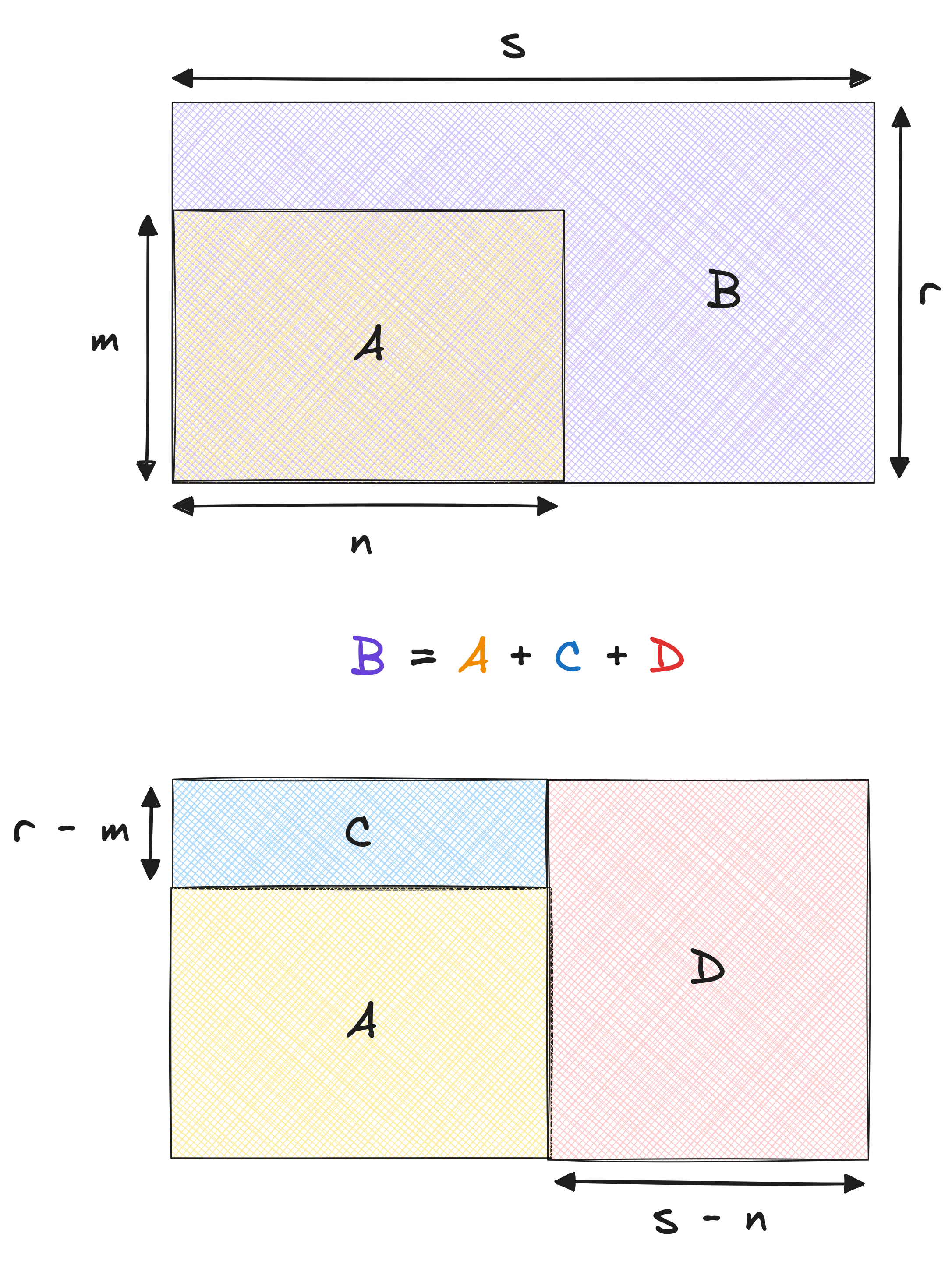
The KPI evolution can thus be allocated into two buckets. The first bucket is due to the evolution of the average claim amount. The second bucket is due to the change in the number of claims. Let’s translate this image to an equation:
$$\textcolor{purple}{KPI_{t+1}} = \textcolor{orange}{KPI_t} + \textcolor{royalblue}{n \times (r - m)} + \textcolor{indianred}{(s - n) \times r}$$
Implementation
This is quite straightforward to perform with pandas.
metric = 'amount'
period = 'year'
dim = 'claim_type'

decomp = (
    claims_df
    .groupby([period, dim])
    [metric].agg(['mean', 'count', 'sum'])
    .reset_index()
    .sort_values([period, dim])
)

decomp['mean_lag'] = decomp.groupby(dim)['mean'].shift(1)
decomp['count_lag'] = decomp.groupby(dim)['count'].shift(1)
decomp['inner'] = decomp.eval('count_lag * (mean - mean_lag)')
decomp['mix'] = decomp.eval('(count - count_lag) * mean')
| year | claim_type | sum | inner | mix |
|---|---|---|---|---|
| 2021 | Dentist | $1104.42 | ||
| 2021 | General Physician | $594.44 | ||
| 2021 | Physiotherapy | $801.78 | ||
| 2021 | Psychiatrist | $1313.90 | ||
| 2022 | Dentist | $622.48 | -$170.70 | -$311.24 |
| 2022 | General Physician | $749.08 | -$95.05 | $249.69 |
| 2022 | Physiotherapy | $339.45 | -$122.88 | -$339.45 |
| 2022 | Psychiatrist | $1179.28 | -$282.03 | $147.41 |
| 2023 | Dentist | $1440.99 | $338.18 | $480.33 |
| 2023 | General Physician | $826.18 | $313.15 | -$236.05 |
| 2023 | Physiotherapy | $1049.15 | $185.12 | $524.57 |
| 2023 | Psychiatrist | $861.71 | $544.14 | -$861.71 |
There we have it: a table that tells us whether the KPI changed due to a change in average claim amount – the inner column – or due to the change in the number of claims – the mix column. I got these names from Martin, who I assume got them from Airbnb.
We can sum both columns to get the total change in the KPI:
(
    decomp.groupby('year')
    .apply(lambda x: (x.inner + x.mix).sum())
    .rename('diff')
)
| year | diff |
|---|---|
| 2021 | |
| 2022 | -$924.25 |
| 2023 | $1287.74 |
This corresponds exactly to the yearly changes calculated above.
Right/left vs. Left/right decomposition
If you’ve been paying attention, you might have noticed that I sliced the KPI arbitrarily. I could have just as well decomposed the KPI as follows:
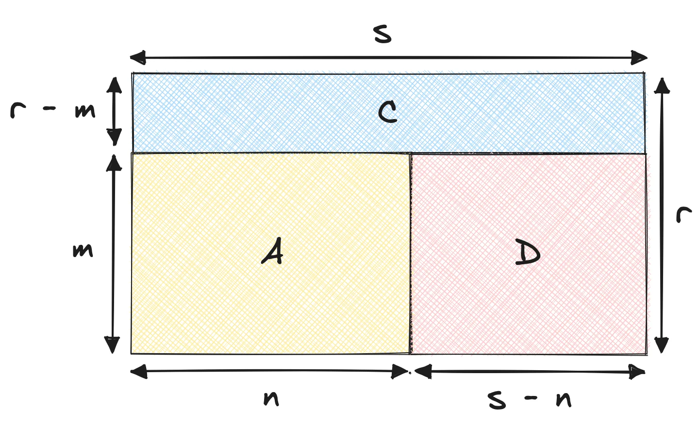
Notice how the C area has grown, while the D area has shrunk. This is because I’ve chosen to decompose the KPI as follows:
$$\textcolor{purple}{KPI_{t+1}} = \textcolor{orange}{KPI_t} + \textcolor{royalblue}{s \times (r - m)} + \textcolor{indianred}{(s - n) \times m}$$
This decomposition is also valid. If we implemented it, we would get slightly different results, but said results would sum up to the same yearly changes.
In the first decomposition, the change in the KPI is the difference in the average times the old denominator, plus the difference in the denominator times the new average. In the second decomposition, the change in the KPI is the difference in the average times the new denominator, plus the difference in the denominator times the old average.
So what’s the difference? Well, the difference is in terms of what we allocate the change to. This comes down to interpretation. In our case, we’re looking at health insurance claims. It makes sense – at least to me – to allocate the change in the KPI to:
- A: The old customers
- B: The increase the old customers pay, due to the average increase
- C: The new customers, who pay with the new average
From what I can tell, the first decomposition is called right/left decomposition, while the second is called left/right decomposition. I’m not sure why, but I’m guessing it has to do with the order in which the terms are calculated. I wouldn’t worry too much about it. What matters is to use a decomposition that makes sense for your use case. In this case, I don’t see an intuitive manner to explain the second decomposition.
Conjugate decomposition
As you might have grasped by now, there are different ways to decompose a KPI. One way is to say that the KPI change comes from:
- A: The old customers, who pay the old price
- B: The old customers, who pay the new price difference
- C: The new customers, who pay the old price
- C: The new customers, who pay the new price difference
This is what the decomposition looks like:
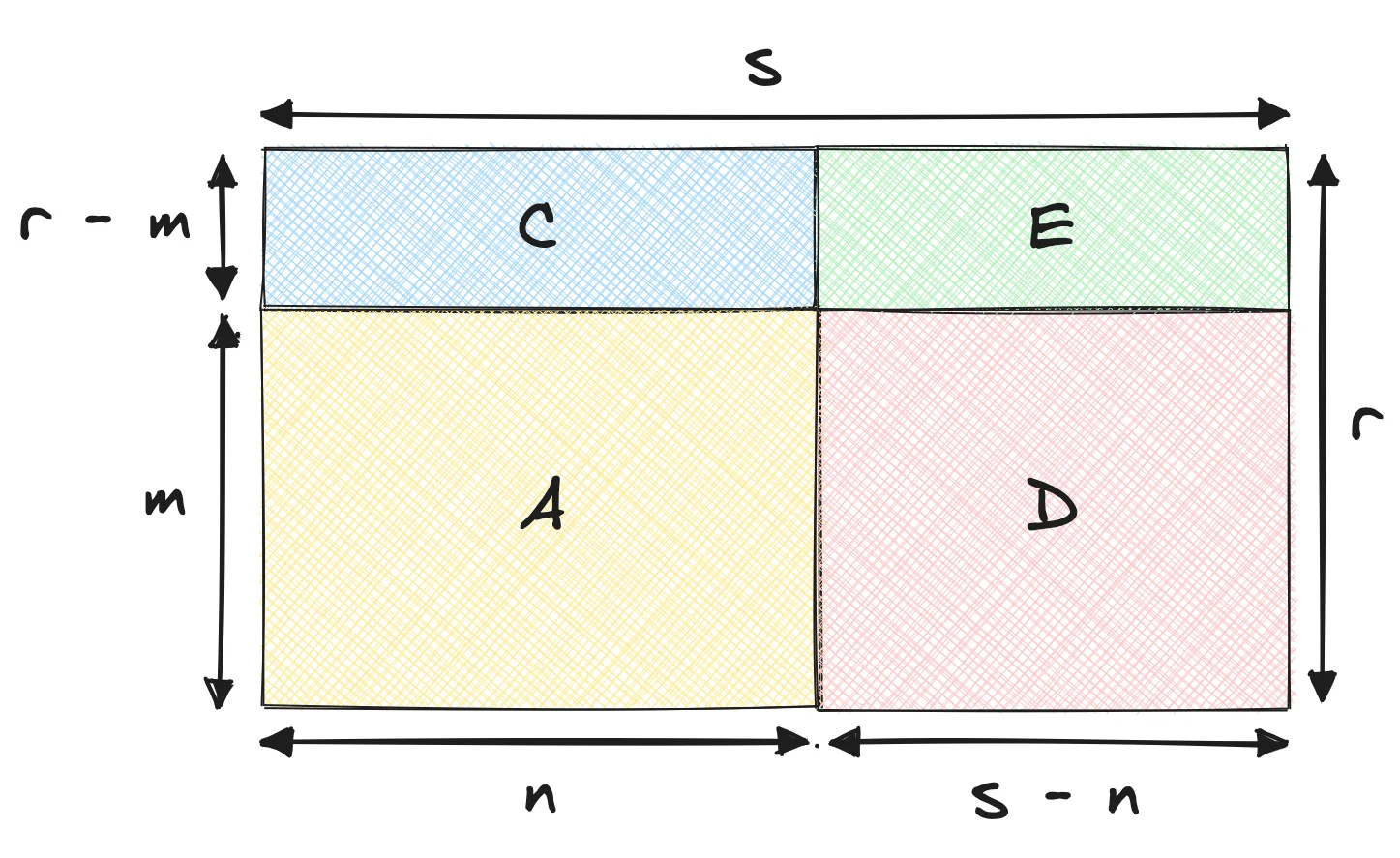
Which equates to:
$$\textcolor{purple}{KPI_{t+1}} = \textcolor{orange}{KPI_t} + \textcolor{royalblue}{n \times (r - m)} + \textcolor{indianred}{(s - n) \times m} + \textcolor{forestgreen}{(s - n) \times (r - m)}$$
I guess this decomposition makes sense. It’s slightly more complex, but it gives more stones to grind for stakeholders who wish to dissect the KPI. I believe this variant is called conjugate decomposition. Again, the names I’m using are gleaned from what Martin Daniel shared with me from his days at Airbnb.
Using the appropriate dimension
The decomposition method is important. But the dimension you use to decompose the KPI is equally important. Up until here, we simply bucketed claims according to their type. We can do something smarter, due to the fact each claim can be attributed to a single person. For any given year, we know whether a claim comes from an existing customer, a new customer, or a returning customer – one who was already with us but didn’t show up for a year.
The customers in the dummy dataset used above make claims each year. I edited the dataset generation script to make new customers appear every year, while existing customers have a 30% chance of not making any claims at all for a given year. I also increased the span to a period of four years. For the sake of simplicity, I’ve reduced the number of claim types to two: dentist and psychiatrist.
New dataset generation script
import collections
import random
import names  # This library generates human names
import pandas as pd

random.seed(42)

# Function to generate a random cost based on the claim type and year
def generate_claim_cost(claim_type, year):
    if claim_type == 'Dentist':
        base_cost = 100
    elif claim_type == 'Psychiatrist':
        base_cost = 150

    # Adjust cost based on year
    if year == 2021:
        base_cost *= 1.2
    elif year == 2023:
        base_cost *= 1.5

    # Add some random variation
    cost = random.uniform(base_cost - 20, base_cost + 20)
    return round(cost, 2)

# Generating sample data
claim_types = ['Dentist', 'Psychiatrist']
years = [2021, 2022, 2023, 2024]
people = ['John', 'Jane', 'Michael', 'Emily', 'William']

data = []
for year in years:
    new_people = (
        [names.get_first_name() for _ in range(random.randint(1, 3))]
        if year > 2021
        else []
    )
    existing_people = [person for person in people if random.random() > 0.3]
    people_this_year = existing_people + new_people
    people.extend(new_people)

    for person in people_this_year:
        num_claims = random.randint(1, 5)  # Random number of claims per existing customer per year
        for _ in range(num_claims):
            claim_type = random.choice(claim_types)
            cost = generate_claim_cost(claim_type, year)
            date = pd.to_datetime(f"{random.randint(1, 12)}/{random.randint(1, 28)}/{year}", format='%m/%d/%Y')
            data.append([person, claim_type, date, year, cost])

# Create the DataFrame
columns = ['person', 'claim_type', 'date', 'year', 'amount']
claims_df = pd.DataFrame(data, columns=columns)

# Indicate whether people are existing, new, or returning
years_seen = collections.defaultdict(set)
statuses = []
for claim in claims_df.to_dict(orient='records'):
    years_seen[claim['person']].add(claim['year'])
    if claim['year'] - 1 in years_seen[claim['person']]:
        statuses.append('EXISTING')
    elif any(year < claim['year'] for year in years_seen[claim['person']]):
        statuses.append('RETURNING')
    elif not {year for year in years_seen[claim['person']] if year != claim['year']}:
        statuses.append('NEW')

claims_df['status'] = statuses

print(claims_df.sample(5).to_markdown(index=False))
| person | claim_type | date | year | amount | status |
|---|---|---|---|---|---|
| Keith | Dentist | 2023-08-18 | 2023 | 135.14 | EXISTING |
| William | Dentist | 2023-03-18 | 2023 | 136.11 | RETURNING |
| Micaela | Psychiatrist | 2025-09-22 | 2025 | 130.07 | NEW |
| Emily | Psychiatrist | 2023-01-24 | 2023 | 211.33 | NEW |
| Luis | Psychiatrist | 2025-04-09 | 2025 | 165.98 | NEW |
Here is the decomposition logic, wherein a second status dimension is added:
metric = 'amount'
period = 'year'
dimensions = ['status', 'claim_type']

decomp = (
    claims_df
    .groupby([period, *dimensions])
    [metric]
    .agg(['mean', 'count', 'sum'])
    .reset_index()
    .sort_values(period)
)

decomp['mean_lag'] = decomp.groupby(dimensions)['mean'].shift(1).fillna(0)
decomp['count_lag'] = decomp.groupby(dimensions)['count'].shift(1).fillna(0)
decomp['inner'] = decomp.eval('(mean - mean_lag) * count_lag')
decomp['mix'] = decomp.eval('(count - count_lag) * mean')
| year | status | claim_type | sum | inner | mix |
|---|---|---|---|---|---|
| 2021 | NEW | Dentist | $614.36 | ||
| 2021 | NEW | Psychiatrist | $697.92 | ||
| 2022 | EXISTING | Dentist | $95.21 | ||
| 2022 | EXISTING | Psychiatrist | $136.51 | ||
| 2022 | NEW | Dentist | $298.29 | -$117.21 | -$198.86 |
| 2022 | NEW | Psychiatrist | $146.05 | -$113.72 | -$438.15 |
| 2023 | EXISTING | Dentist | $740.41 | $52.87 | $592.32 |
| 2023 | EXISTING | Psychiatrist | $222.52 | $86.01 | $0.00 |
| 2023 | NEW | Dentist | $1470.75 | $142.93 | $1029.52 |
| 2023 | NEW | Psychiatrist | $2001.49 | $76.33 | $1779.10 |
| 2023 | RETURNING | Dentist | $756.14 | $0.00 | $756.14 |
| 2024 | EXISTING | Dentist | $590.42 | -$248.39 | $98.40 |
| 2024 | EXISTING | Psychiatrist | $1019.17 | -$76.92 | $873.57 |
| 2024 | NEW | Dentist | $94.78 | -$522.95 | -$853.02 |
| 2024 | RETURNING | Dentist | $96.26 | -$274.84 | -$385.04 |
| 2024 | RETURNING | Psychiatrist | $166.10 | $0.00 | $166.10 |
It’s worth taking some time to understand this table. It gives a good idea of the potential of a decomposition framework, even though the underlying KPI is just a simple sum. Mainly, we are able to attribute growth to existing, new, and returning customers. But more than that, we are able to tell how the growth from each customer source has evolved.
For instance, dentist claims for existing customers grew from \$95.21 in 2022 to \$740.41 in 2023. That’s a \$645.20 increase, which is decomposed into two parts. \$52.87 is due to the increase of the average dentist claim price. The bulk of the growth, \$592.32, is due to people going to the dentist more often.
What I love about this framework is that it produces concrete figures. We could have plotted the average dentist claim price alongside the number of dentist claims per year. We would have seen that the average price went up, and that the number of claims went up. But we wouldn’t have been able to tell how much of the growth was due to the increase in average price, and how much was due to the increase in number of claims.
I’ll leave it at that for decomposing a sum. Let’s move on to decomposing a ratio, which is more complex.
Decomposing a ratio
Intuition
Ratios are another type of KPI that can be decomposed. Let’s say we want to calculate the average claim amount per claim. We can do this by dividing the total amount by the number of claims.
| year | average | diff |
|---|---|---|
| 2021 | $145.80 | |
| 2022 | $112.67 | -$33.13 |
| 2023 | $173.04 | $60.36 |
| 2024 | $122.92 | -$50.12 |
Our wish is to distinguish between the change in the average amount by type of claim, as well as the evolution in volume of said claim types. For instance, the average amount might have gone down because there are more claims on the cheap side, or because the average amount per claim decreased.
The average, of course, is just a ratio between the total amount, and the number of claims.
$$KPI = \frac{1}{n} \sum_{i=1}^n x_i$$
It decomposes like this:
$$KPI = \sum_{j=1}^m \frac{n_j}{n} (\frac{1}{n_j} \sum_{i=1}^{n_j} x_{ji})$$
In other words, in order to understand why the average fluctuated, we have to study the variation of two quantities:
- The share each group represents in the total, which is $\frac{n_j}{n}$
- The average amount in each group, which is $\frac{1}{n_j} \sum_{i=1}^{n_j} x_{ji}$
Don’t be alarmed: we are still looking to decompose the KPI in terms of volume change and average change. But the volume change is now expressed in terms of share of the total, and the average change is expressed in terms of average per group.
It’s a bit of a mindfuck because the KPI is an average. Both quantities are not independent, because they share $n_j$. Decomposing a sum is simpler due to its associative property, which an average doesn’t possess. From my experience, it’s better to first look at some equations, and then at some visuals. Please bear with me 🐻
First, let’s define $KPI_t$ as the value of the KPI – i.e. the ratio – at time $t$. The following identity is a simplified version of the last equation, stating that $KPI_t$ is the sum of the product of shares $s_j(t)$ and ratios $r_j(t)$:
$$KPI_t = \sum_{j=1}^m s_j(t) \times r_j(t)$$
I’ve simply introduced $s_j(t) = \frac{n_j}{n}$ and $r_j(t) = \frac{1}{n_j} \sum_{i=1}^{n_j} x_{ji}$ for the sake of simplicity. We are interested in studying the evolution of the KPI between $t$ and $t+1$:
$$KPI_{t+1} - KPI_t = \sum_{j=1}^m s_j(t+1) \times r_j(t+1) - \sum_{j=1}^m s_j(t) \times r_j(t)$$
The terms in each sum can be regrouped into a single sum:
$$KPI_{t+1} - KPI_t = \sum_{j=1}^m [s_j(t+1) \times r_j(t+1) - s_j(t) \times r_j(t)]$$
The expression in the sum can be split into two parts. The first part is the change due to the $r_j$ values, while the second part is the change due to the $s_j$ values:
$$ \begin{align*} KPI_{t+1} - KPI_{t} &= \sum_{j=1}^m [s_j(t+1) \times r_j(t+1) - s_j(t+1) \times r_j(t) + s_j(t+1) \times r_j(t) - s_j(t) \times r_j(t)] \\ &= \sum_{j=1}^m s_j(t+1) \times (r_j(t+1) - r_j(t)) + \sum_{j=1}^m (s_j(t+1) - s_j(t)) \times r_j(t) \end{align*} $$
This decomposition is valid. However, the second term – the mix effect – isn’t exactly what we want. The mix effect’s purpose is to measure the impact of change in share. If the share of a group increases, the mix effect should be positive if the rate of that group is higher than the average rate, and negative if the rate of that group is lower than the average rate. We can obtain by replacing $r_j(t)$ with $r_j(t) KPI_t$, without changing the value of the sum:
$$ \begin{align*} KPI_{t+1} - KPI_{t} &= \sum_{j=1}^m s_j(t+1) \times (r_j(t+1) - r_j(t)) \\ &+ \sum_{j=1}^m (s_j(t+1) - s_j(t)) \times (r_j(t) - KPI_t) \end{align*} $$
There we have it. We’ve expressed $KPI_{t+1}$ as the sum of:
- The initial KPI value $KPI_{t}$
- The inner effect: the change in the average value of each group
- The mix effect: the change in the share of each group
I sought out a geometrical interpretation of this decomposition. I found one, sort of, but it’s not as easy to grasp as the one for the sum. Here are some dummy figures to help us visualize the decomposition:
| Year | Group | Denominator | Share | Ratio | Share x ratio | Group sum |
|---|---|---|---|---|---|---|
| 2021 | A | 1000 | 33% | 15% | 5% | 10% |
| 2021 | B | 2000 | 67% | 7.5% | 5% | |
| 2022 | A | 800 | 40% | 11% | 4.4% | 6.8% |
| 2022 | B | 1200 | 60% | 4% | 2.4% |
In terms of visualization, my idea was to leverage the fact a mean within a group can be expressed as the product between the share the group represents, times the ratio within said group. Thus, the product can be visualized as a vector sum. Here is a visualization of this table:
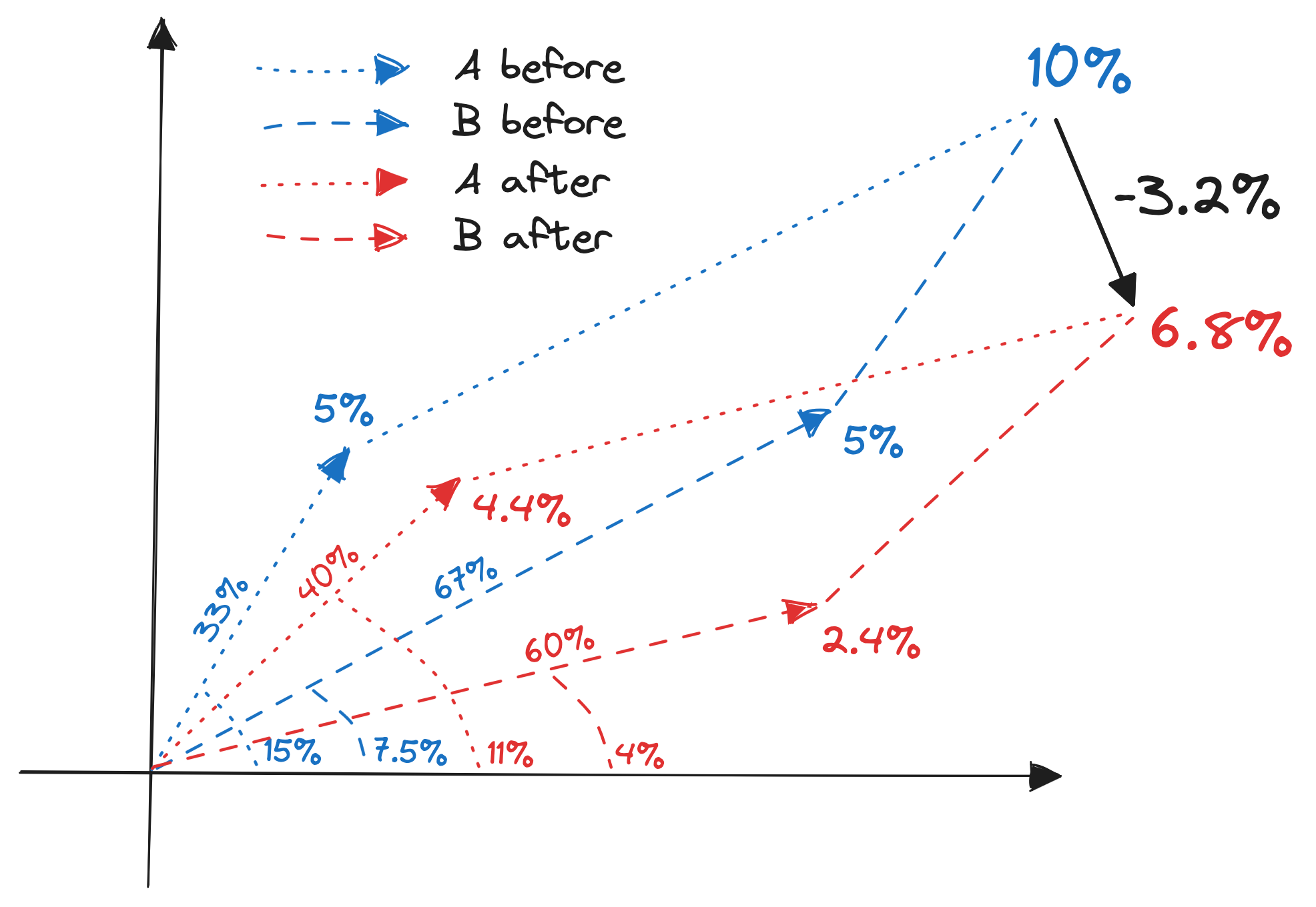
This is then how I visualize the decomposition:
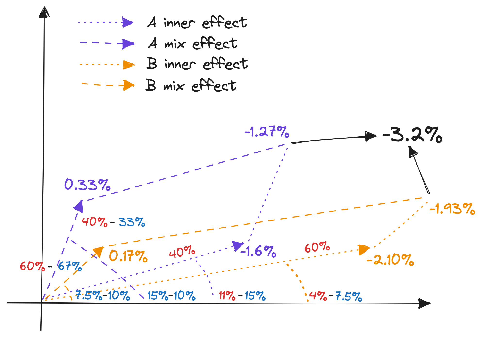
And here is the tabular breakdown of this decomposition:
| Group | Inner | Mix | Total |
|---|---|---|---|
| A | 40% $\times$ (11% - 15%) = -1.6% | (40% - 33%) $\times$ (15% - 10%) = 0.33% | -1.27% |
| B | 60% $\times$ (4% - 7.5%) = -2.1% | (60% - 67%) $\times$ (7.5% - 10%) = 0.17% | -1.93% |
| Total | -3.7% | 0.5% | -3.2% |
The math is not easy to follow, nor is the geometrical interpretation. But the intuition is straightforward: the change in the KPI is the sum of the change in the average value of each group, and the change in the share of each group. It’s just a tad more complicated because the KPI is a ratio, not a sum.
I’ve also written a little Python script to prove the formulas work from a numerical point of view.
Numeric verification script
# denominators
D = [
    [1000, 2000],
    [800, 1200]
]
# shares
S = [
    [dj / sum(d) for j, dj in enumerate(d)]
    for i, d in enumerate(D)
]
# numerators
N = [
    [150, 150],
    [88, 48]
]
# ratios
R = [
    [ni / di for ni, di in zip(n, d)]
    for n, d in zip(N, D)
]
# shares x ratios
SR = [
    [ri * si for ri, si in zip(r, s)]
    for r, s in zip(R, S)
]
# global means
M = list(map(sum, SR))
# KPIs
KPI = [
    sum(ri * si for ri, si in zip(r, s))
    for r, s in zip(R, S)
]
# decomposed KPI
inner = sum(S[1][i] * (R[1][i] - R[0][i]) for i in range(2))
mix = sum((S[1][i] - S[0][i]) * (R[0][i] - KPI[0]) for i in range(2))
KPI[1] == KPI[0] + inner + mix
Implementation
Let’s get back to our health insurance toy problem. Recall that we’re looking to explain the evolution of the yearly average claim amount:
averages = claims_df.groupby('year')['amount'].mean()
averages = pd.DataFrame({
    'average': averages,
    'diff': averages - averages.shift()
})
| year | average | diff |
|---|---|---|
| 2021 | $145.80 | |
| 2022 | $112.67 | -$33.13 |
| 2023 | $173.04 | $60.36 |
| 2024 | $122.92 | -$50.12 |
We’re studying a ratio. The first thing to do is determine the numerator and the denominator of this ratio. In this example, the numerator is the total amount of claims, and the denominator is the number of claims:
metric = 'amount'
period = 'year'
dimension = 'claim_type'

decomp = (
    claims_df
    .groupby([period, dimension], dropna=True)
    [metric].agg(['sum', 'count'])
    .reset_index()
    .sort_values(period)
)
| year | claim_type | sum | count |
|---|---|---|---|
| 2021 | Dentist | $614.36 | 5 |
| 2021 | Psychiatrist | $697.92 | 4 |
| 2022 | Dentist | $393.50 | 4 |
| 2022 | Psychiatrist | $282.56 | 2 |
| 2023 | Dentist | $2967.30 | 20 |
decomp['ratio'] = decomp.eval('sum / count')
decomp['share'] = (
    decomp['count'] /
    decomp.groupby('year')['count'].transform('sum')
)
decomp['global_ratio'] = (
    decomp.groupby('year')['sum'].transform('sum') /
    decomp.groupby('year')['count'].transform('sum')
)
decomp['ratio_lag'] = decomp.groupby(dimension)['ratio'].shift(1)
decomp['share_lag'] = decomp.groupby(dimension)['share'].shift(1)
decomp['global_ratio_lag'] = decomp.groupby(dimension)['global_ratio'].shift(1)
decomp['inner'] = decomp.eval('share * (ratio - ratio_lag)')
decomp['mix'] = decomp.eval('(share - share_lag) * (ratio_lag - global_ratio_lag)')
| year | claim_type | inner | mix |
|---|---|---|---|
| 2021 | Dentist | ||
| 2021 | Psychiatrist | ||
| 2022 | Dentist | -$16.33 | -$2.54 |
| 2022 | Psychiatrist | -$11.06 | -$3.18 |
| 2023 | Dentist | $33.32 | $0.00 |
| 2023 | Psychiatrist | $27.04 | $0.00 |
| 2024 | Dentist | -$25.34 | $4.11 |
| 2024 | Psychiatrist | -$37.12 | $8.22 |
In 2023, the fact the mix effect is nil for both dentist and psychiatrist claims means the distribution of claim types remained unchanged. Then, in 2024, the mix effect is positive for dentist claims and psychiatrist claims because the balance shifted towards psychiatrist claims. The latter are more expensive than dentist claims, so the mix effect is positive. However, the inner effect in 2024 is negative for both claim types because the average claim amount decreased for both claim types.
Here’s how to verify these contribution amounts sum up correctly:
(
    decomp
    .groupby('year')
    .apply(lambda x: (x.inner + x.mix).sum())
)
| year | sum |
|---|---|
| 2021 | $0.00 |
| 2022 | -$33.13 |
| 2023 | $60.36 |
| 2024 | -$50.12 |
Going further
I’ve been fairly obsessed with this topic ever since joining Carbonfact. A lot of the work we do for our customers is data analysis: explaining how much CO2e they’re emitting, why, and how to reduce it. Having a solid decomposition framework helps us do this. There are many tangents to this topic that I haven’t yet fully explored, but which I think are worth mentioning.
When it’s not MECE
All the grouping we’ve done assumes the MECE principle (mutually exclusive, collectively exhaustive). That is, there is no overlap in the values of the dimension by which the data is grouped. It isn’t clear to me what to do in the case where an observation may take several values for a single dimension. For instance, if I were studying YouTube videos, I wouldn’t know how to decompose number_of_videos x views_per_video using tags – because a video may have several tags. I would love to see an extension which supports this case.
Decomposition methods in economics
In the field of economics, there is a bunch of literature on the topic of decomposition methods. For instance, these papers decompose productivity growth, by allocating growth to new companies, exiting companies, and existing companies.
I also stumbled upon the Kitagawa-Blinder-Oaxaca decomposition. This seems like a way to explain the difference of a value between two groups, when the value can be modelled as a linear regression. This is powerful: if you don’t know the formula behind a KPI, but can fit it with a regression model, then you can decompose it using this method.
Automatic differentiation
To me, the best KPIs are sums and ratios, because they’re easy to explain and debug. But what to do when the KPI is a more complex function? Something I’ve been thinking in the back in my mind is to formulate a KPI as a function, and differentiate it with respect to quantities of interest.
For instance, if I’m studying the number of views of a YouTube video, I could differentiate the number of views with respect to the number of likes, and see how much the number of views would change if the number of likes increased. I’d like to do this with an autodiff framework like micrograd.
Metric trees
A recent trend I’ve been following is the metric tree. It’s this idea that a KPI can be represented as a tree. Abhi Sivasailam gave an in-depth talk about it at Data Council Austin 2023. Ergest Xheblati summarized the underlying motivation quite well on LinkedIn:
What you want is to figure out what actions you need to take to improve the effectiveness of your business at achieving the goals it was designed for.
In short, it’s not enough to implement a KPI. You have to surface the intermediate results as well. That way, you get a clear understanding of what drives the KPI. To me, this is reminiscent of the distinction between input and output metrics. This becomes extremely powerful if you bake in comparison between two points in time.
An instance of metric trees I’ve been impressed with is Count, which is Figma like tool for data analysis. They allow you to build a visual metric tree. You can then copy/paste the tree, allowing you to get a side-by-side comparison. Maybe this visual approach is even better than decomposition formulas.
Funnel decomposition
A cool thing you can do is decompose funnel metrics. For instance, if you’re studying the number of views of a YouTube video, you can decompose it into the number of impressions, the click-through rate, and the watch time. This is a good way to understand what drives the number of views. It would be great to see baked in to something like Motif’s sequence analytics.
I was going to tackle this in my post. But it’s a bit too chunky, so I’ll leave it for another time.
Semantic layer
The semantic layer is a hot topic in the BI world. It’s the idea that you can build a layer of abstraction on top of your data warehouse, which allows you to define (reusable) metrics in a declarative fashion. Christophe Blefari, who is good at following trends, gives a good overview of it here. I mention it because I believe adding decomposition methods to the semantic layer could be very impactful.
Making an open source library
As you might have noticed, I didn’t implement every variant of the decomposition formulas. For instance, I didn’t implement the right/left and conjugate variants for ratio decomposition. There might be value in implementing all these variants into a nice library. Nowadays, I’m not sure what’s best between writing a Python package or a dbt extension. Anyway, if you’re interested, let me know!